How to Choose Paint Colors for Your Home Without the Stress
The paint aisle can be overwhelming. Hundreds of chips, dozens of whites, and names that tell you nothing about what the color will actually look like on your wall. If you've ever painted a room only to realize the "greige" looks purple at night, you're not alone. Learning how to choose paint colors comes down to a few simple principles, and once you know them, the process gets so much easier.
This is the method we use for every room, from nurseries to kitchens. Use our color palette generator along the way to explore combinations that work together.
Start with What Stays in the Room
Paint is the easiest thing to change, so choose it last. Start with the items that are staying: your sofa, flooring, countertops, cabinets, rugs, or a favorite piece of art.
- Gather photos of the fixed elements in the room in natural daylight.
- Pull out the main colors and notice whether they lean warm (yellow, red, orange) or cool (blue, green, purple).
- Choose paint colors that share or complement those undertones.
A fabric swatch, rug, or throw pillow you love can also be your color inspiration. Many paint stores can match or suggest colors pulled from a pattern.
Understand Undertones
Undertones are the subtle colors hiding beneath the main color, and they're the reason two whites or two grays can look so different. A gray may lean blue, green, or purple. A beige may lean pink, yellow, or green.
- Compare chips side by side. Undertones show up most clearly when you compare similar colors next to each other.
- Hold chips against pure white paper. This makes undertones easier to spot.
- Look at the darkest color on a paint strip. It often reveals the undertone of the lighter colors above it.
How to Choose Paint Colors for Your Room's Light
Light changes everything. The same paint can look completely different in two rooms of the same house.
- North-facing rooms get cooler, indirect light. Warm colors help them feel cozy, while very cool grays can feel flat.
- South-facing rooms get warm, bright light most of the day. Both warm and cool colors usually work.
- East-facing rooms are bright and warm in the morning, cooler later.
- West-facing rooms are softer in the morning and glow warm in the late afternoon.
Light bulbs matter too. Warm bulbs (around 2700K) add a yellow cast, while cooler bulbs (4000K and up) look bluer. Test your samples under the bulbs you actually use.
Check the LRV
Many paint brands list a Light Reflectance Value, or LRV, on a scale from 0 (black) to 100 (pure white). Higher numbers reflect more light. For a dark room, a color with a higher LRV will help it feel brighter.
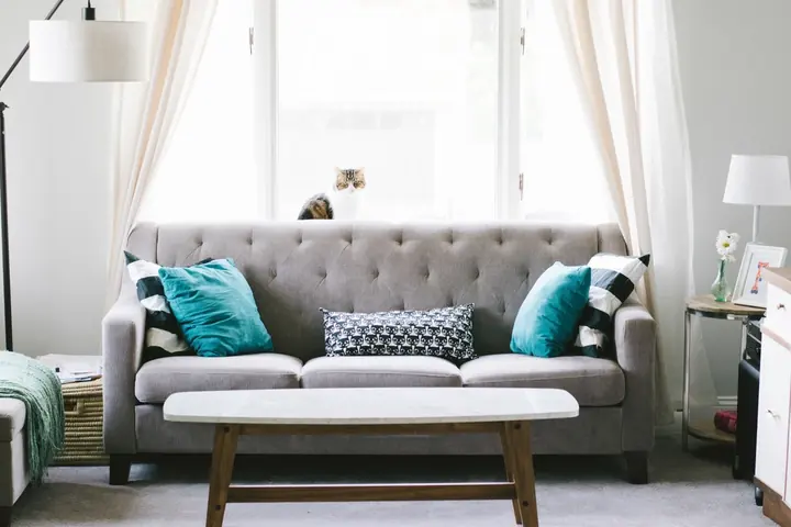
Build a Simple Palette with the 60-30-10 Rule
The 60-30-10 rule is a classic designer guideline for balancing color in a room:
- 60% is your main color, usually the walls.
- 30% is a secondary color, such as furniture, curtains, or an accent wall.
- 10% is an accent color in pillows, art, and accessories.
For the whole house, choose a few colors that flow well from room to room, especially in spaces you can see from one another. Keeping trim and ceilings the same white throughout helps tie everything together.
Test Samples the Right Way
Never choose a color from a tiny chip alone. Testing is the step that saves you from repainting.
- Narrow your choices to two or three colors.
- Buy sample pots or peel-and-stick samples.
- Paint large swatches, at least 2 feet by 2 feet, on poster board or directly on the wall with two coats.
- Move the boards around the room, near the floor, near the window, and in corners.
- Live with them for a few days and look at them morning, noon, and night.
Common Paint Color Mistakes to Avoid
- Choosing from a tiny chip. Colors almost always look brighter and more saturated on a full wall than on a small card.
- Ignoring the ceiling and trim. A stark, cool white trim can clash with a warm wall color. Compare them together.
- Testing on the old wall color. A bold existing color can change how a sample looks. Paint samples on white poster board for a truer read.
- Picking every room separately. Rooms that open to each other should feel connected, even if the colors differ.
- Going too dark in a small, dim room without testing first. Deep colors can be cozy and beautiful, but they need careful sampling.
Pick the Right Sheen and Quantity
Sheen affects both look and durability:
- Flat or matte: hides wall flaws, best for ceilings and low-traffic rooms.
- Eggshell: a soft glow and easier to wipe, great for living rooms and bedrooms.
- Satin: more scrubbable, good for kids' rooms, hallways, and bathrooms.
- Semi-gloss: durable and shiny, ideal for trim, doors, and cabinets.
Once you've chosen, use our paint calculator to estimate how many gallons you need. Planning furniture updates in the same palette? See how to paint furniture with chalk paint, and for more ways to refresh a room, browse our budget decor ideas.
Frequently asked questions
How many paint samples should I test?
Two or three is usually enough. Testing more than that at once can make it harder to see the differences clearly.
What paint sheen is best for a family home?
Eggshell works well for most living spaces, satin for high-traffic areas and kids' rooms, and semi-gloss for trim and doors.
Why does my paint color look different on the wall?
Lighting, undertones, and surrounding colors all affect how paint looks. That's why it helps to test large samples in the actual room.